Manasquan Fireman’s Fair Advertising
Keeping a consistent visual appearance is crucial when designing materials for an event. Palette and visual elements need to align in order for viewers and customers to associate the event with the advertisements. To practice designing visuals for a branded event, I created a variety of print and digital materials for a summer fair in my area.
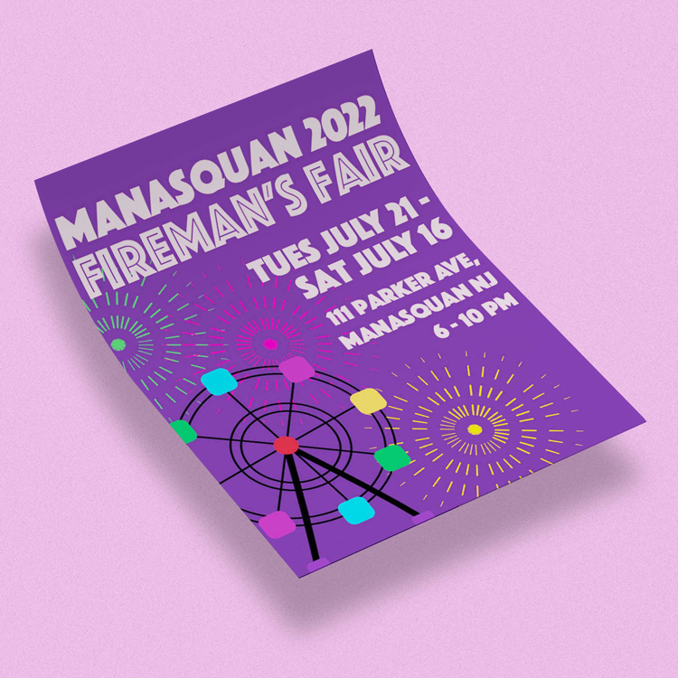
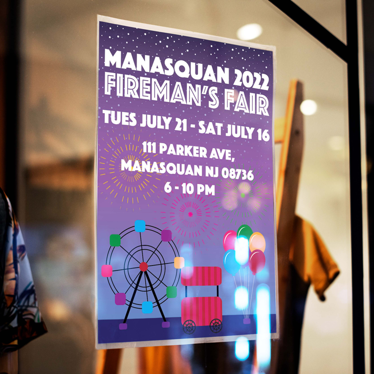
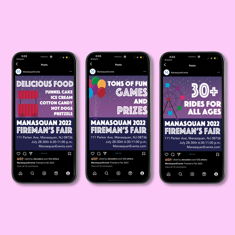
I started by creating a poster for the fair that would serve as the main piece of visual advertising. I designed graphics of iconic fair features, such as fireworks, balloons, and a ferris wheel that would immediately remind viewers of a fair. I also chose a fun, bold font that would stand out to viewers. Once I finished the fair poster, I carried over the brand to other marketing materials. I created a flyer that could be handed out to the community and three Instagram posts that could spread awareness of the event on social media. The Instagram posts each had a different theme, calling out the fair highlights.
This project allowed me to practice designing for many different formats as well as streamlining a branded design across several different advertisement strategies.
Graphics designed using Adobe Illustrator and Photoshop. Layout designed using Adobe Indesign.